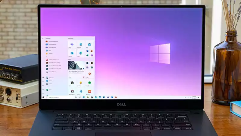
What's the next look for Windows 10? Well, it could be what we have already seen. The Desktop, Start Menu, and Action Center look to be a bit more Fluent.
That's according to code discovered by Windows Latest in the latest Dev Channel build of Windows 10, Build 20197. This new release includes references to "WinUI" in the Windows 10 Start Menu and Action Center.
A scan of Microsoft Program Database (PDB) files revealed that these three features are currently being tested internally (and therefore cannot be tested in 20197):
WinUI is Microsoft's next interface platform and will be used in upcoming folding devices like Windows 10X and Surface Duo. It is also expected to be included in Windows 10, but the timeline for this is not clear.
On Microsoft's Github page dedicated to WinUI, the company describes the new platform as "an easy way to build a modern, seamless UI that feels natural on any Windows device. It is intuitive, accessible, and embodies Fluent Design, which enables powerful experiences and modern user interface patterns.
This positions WinUI similarly to the recent changes made to the Start menu, which is currently still in the Windows Insider testing phase. If you want a taste, check out our walkthrough of how to get the new Windows 10 Start Menu.
For those unfamiliar, the Fluent Design changes - which include more transparency, opacity, rounded edges, lively icons and gorgeous 3D effects among a treasure trove of UI goodies - seem to give Windows a little more pop and visual flair Looks.
Putting these changes into the Action Center and Start menu makes sense since they are some of the most visible parts of the Windows 10 interface, and this test may give us a chance to see Fluent Design in action more.
When will these features be available? That is unknown at best, but we will keep an eye on the upcoming Windows 10 Insider build.


Comments