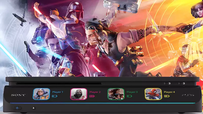
Aside from the V-shaped PS5 development kit, a new beauty has arrived. Yes, as we slowly get a glimpse of what the actual PlayStation 5 will look like, designers are hard at work showing Sony what it should look like. More than just a still image, this virtual press kit posted on Behance by designer Abdelrahman Shaapan is like a resume suggesting that some company should hire them for a PR job. Or perhaps Sony should borrow their brains.
But look at this. It's so minimalist and cool that I initially mistook it for the kind of kitchen scale you might see on a fine dining channel on YouTube. I was drooling over it, just like I do when I watch Bon Appetit chef Brad Leone at work.
What I like about this PS5 change from the PS4 is the visual distinction between the power and eject buttons. The concept also features dual USB-C charging ports.
The display on the front edge of the PS5 render immediately divided opinion in our office. I like this as a way to display the current battery level.
So Sony, make a cooler PS5. I dare say.






Comments