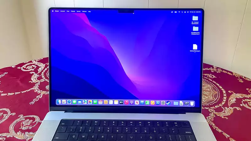
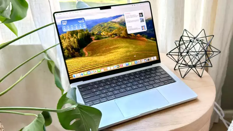
The MacBook Pro 2021 lineup offers tremendous power, a great display, enviable battery life, and plenty of ports. It's a dream laptop, but the macOS menu bar seems to be incompatible with the new display notch.
Quinn Nelson took to Twitter to illustrate a troubling inconsistency in the new laptop's notch. In some cases, when the menu bar at the top of the display fills up with options, which can happen when certain apps are open, the headings eventually disappear behind the notch and become invisible.
Nelson sees this when using the iStat Menus app.
Confusingly, some apps do not seem to work this way. In a follow-up tweet, Nelson indicates that the video editing software DaVinci Resolve skips the cursor from one side of the notch to the other when approached from the side or prevents the cursor from moving down the notch.
Most criticism of the MacBook Pro's new notch has revolved around its intrusive design, but this seems like a larger potential annoyance. macOS by default allows the cursor to move below the notch, and menu headings seem to extend below the notch, but there are ways for developers to prevent this.
Perhaps it could be argued that this is an edge case and does not interfere with most people's MacBook Pro experience. It is not Apple's responsibility to be consistent, and they could even just provide developers with tools and let them choose how their apps work in the notch.
But on the other hand, these are brand new laptops that cost thousands of dollars and are often a user's primary work device. Considering how much users pay and how important it is that apps work consistently and intelligently, users deserve more than this.
Of course, many MacBook Pros are still in limbo due to high demand and limited inventory. Hopefully by the time they reach users, Apple will have issued an update or developers will be used to working with the new notched displays and this problem will have disappeared.


Comments